Listen to This – Infographic & Print
- Designer Joe Gallagher
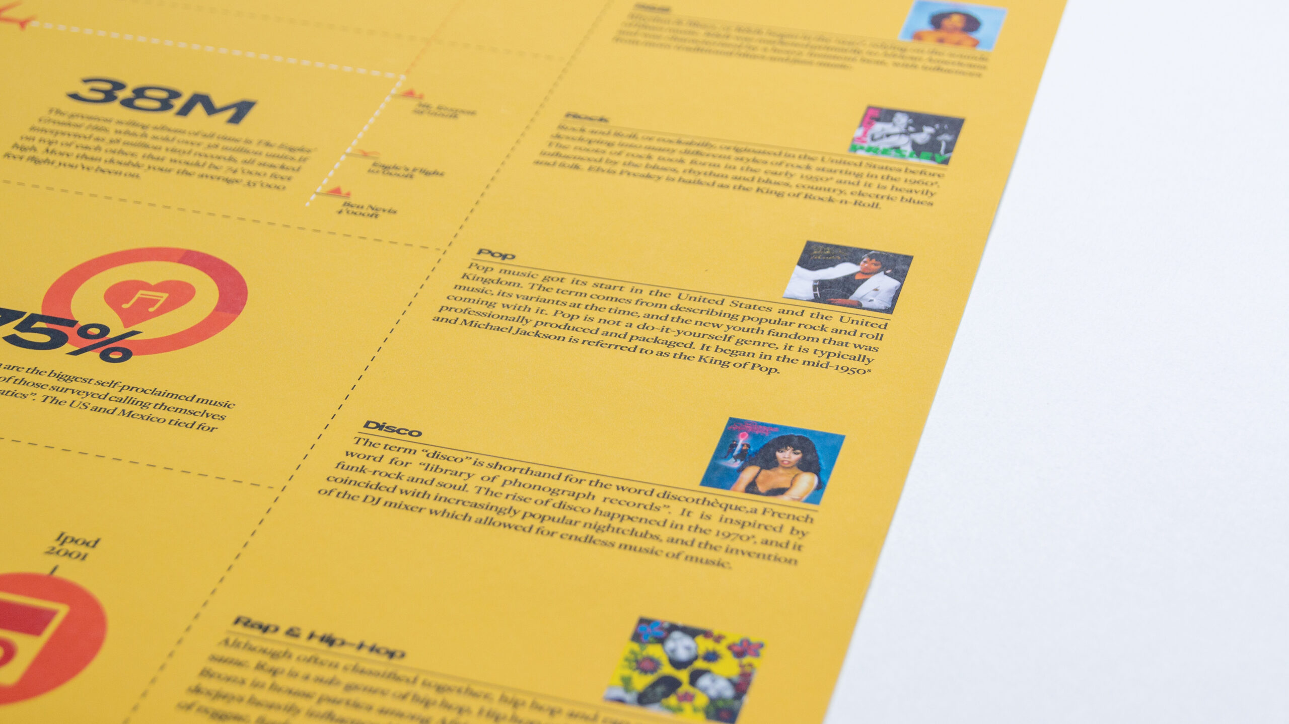
Listen to This is an infographic poster based loosely off a report I wrote on ‘the relevance of album art today’. The brief was to make this into an A2 poster that would work on its own as well as a middle double page spread of an editorial – Liner Notes.
As a stand-alone poster I wanted it to pack some punch, which is why I chose the yellow and black colours. This works in harmony with the tints of red used which overall works out to be a sophisticated but entertaining palette. Sophistication is key in an infographic as you don’t want the information to be belittled at all or undercut.
The poster showcases a lot of information without being overbearing, and the variation of infographic styles keep the reader interested and engaged. To avoid a vector graphic overload, a vinyl cut-out and album cover images are used to break up the visual content.
It makes use of rules and icons to draw your eye down the page and encourage the reader to explore the content while not being too confused.
Within the editorial, the piece works well as it is quite incongruous to the rest of the publication – which is usually the case with magazines, periodicals etc.
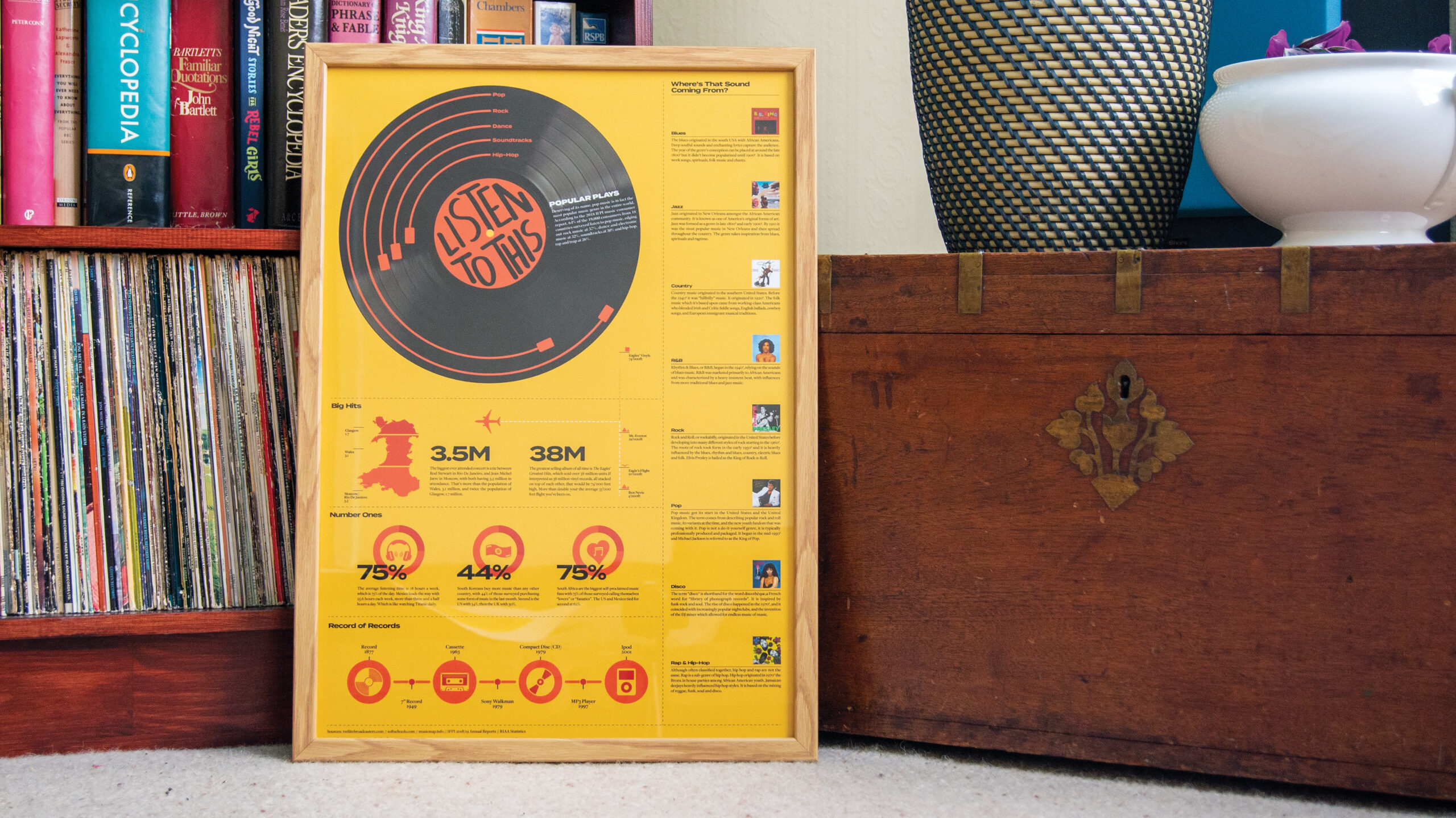
Poster in full in a frame
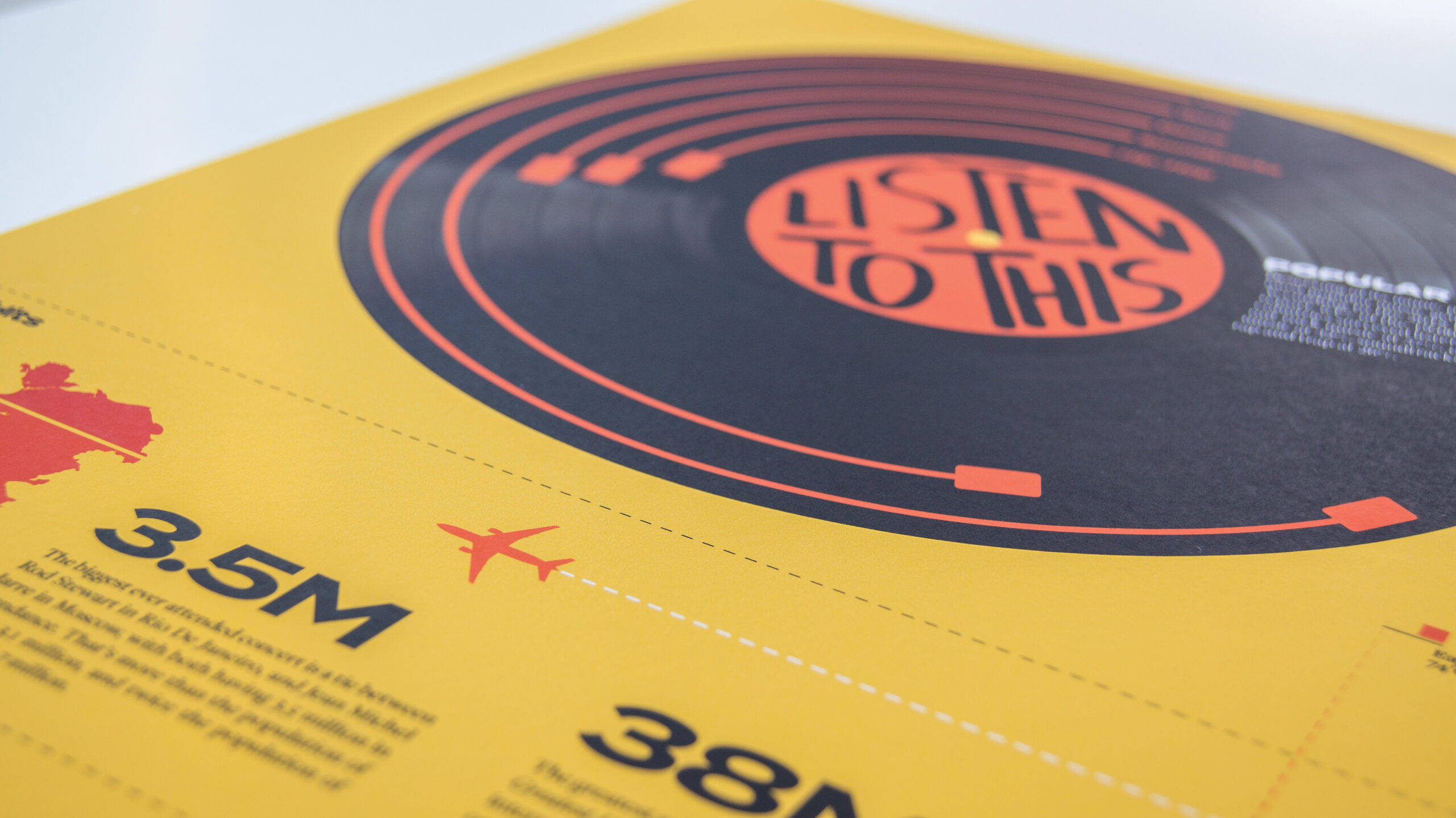
Record is the focus point of the page which helps the reader begin viewing
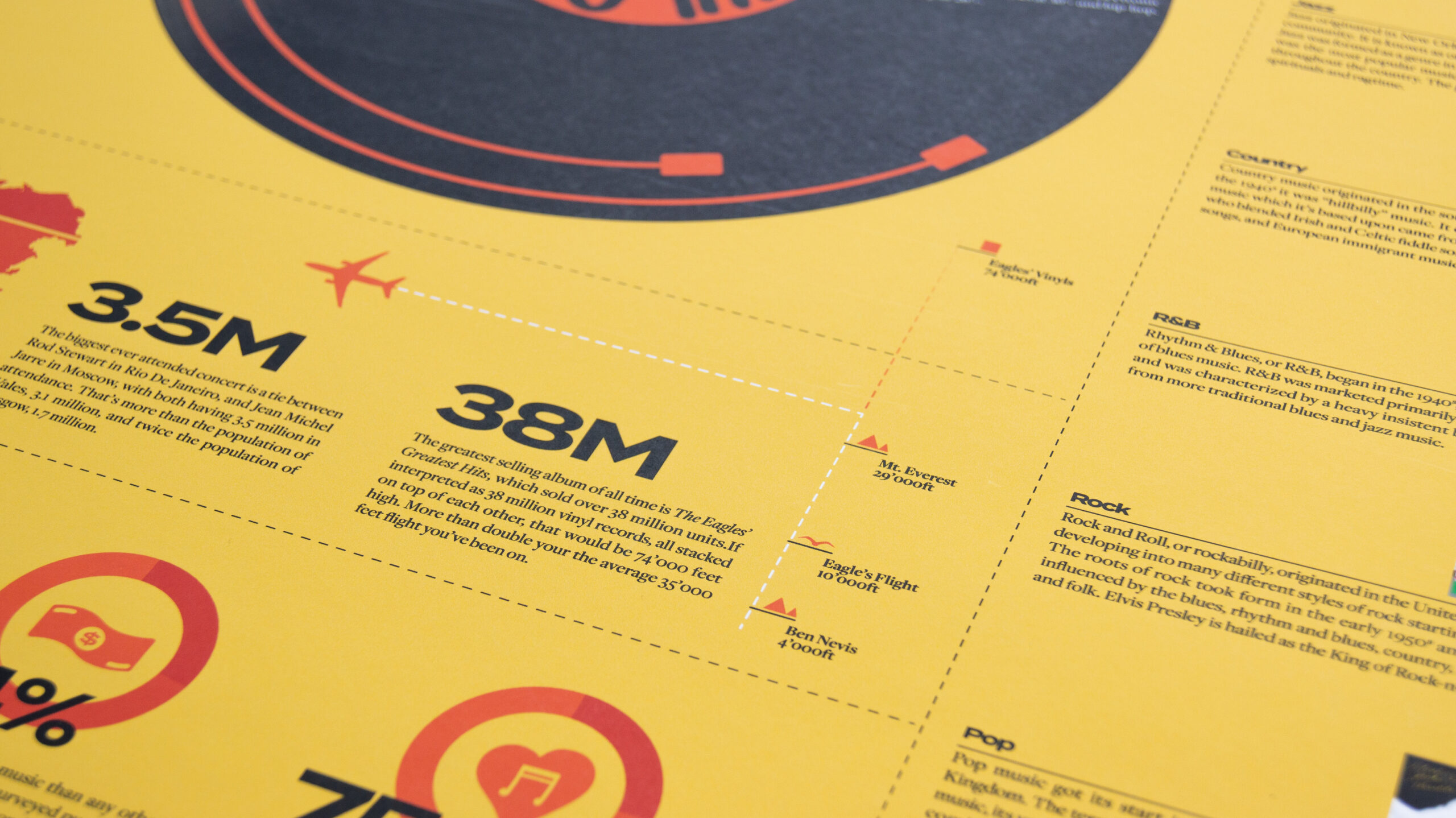
Depth in icon design and playful rules lead you down the page
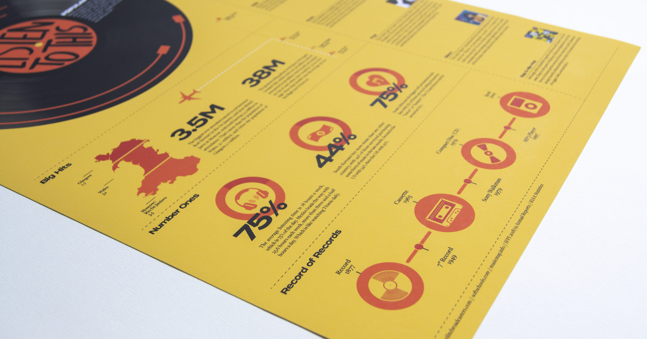
Variety of types of infographic to keep the reader entertained
Typography is considered with photography to break up vectors