Liner Notes – Editorial & Print
- Designer Joe Gallagher
Liner notes is a conceptual periodical based on a report I wrote on ‘the relevance of album art today’. It includes many other articles about music, art, and design, and has a thought-provoking breadth to its overall content.
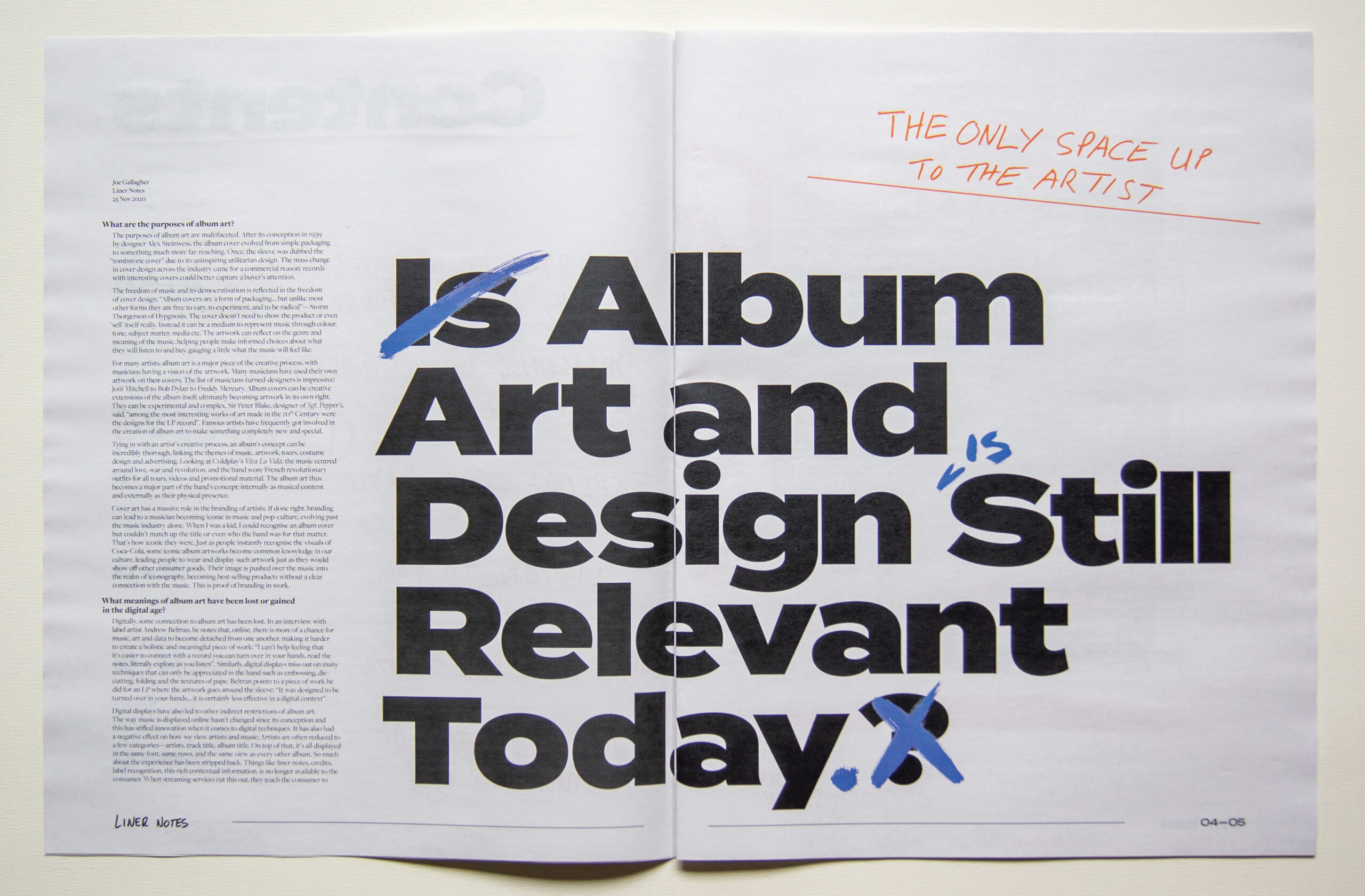
The project is printed at a large size, so it was interesting designing for a larger format and adjusting the type and hierarchy accordingly.
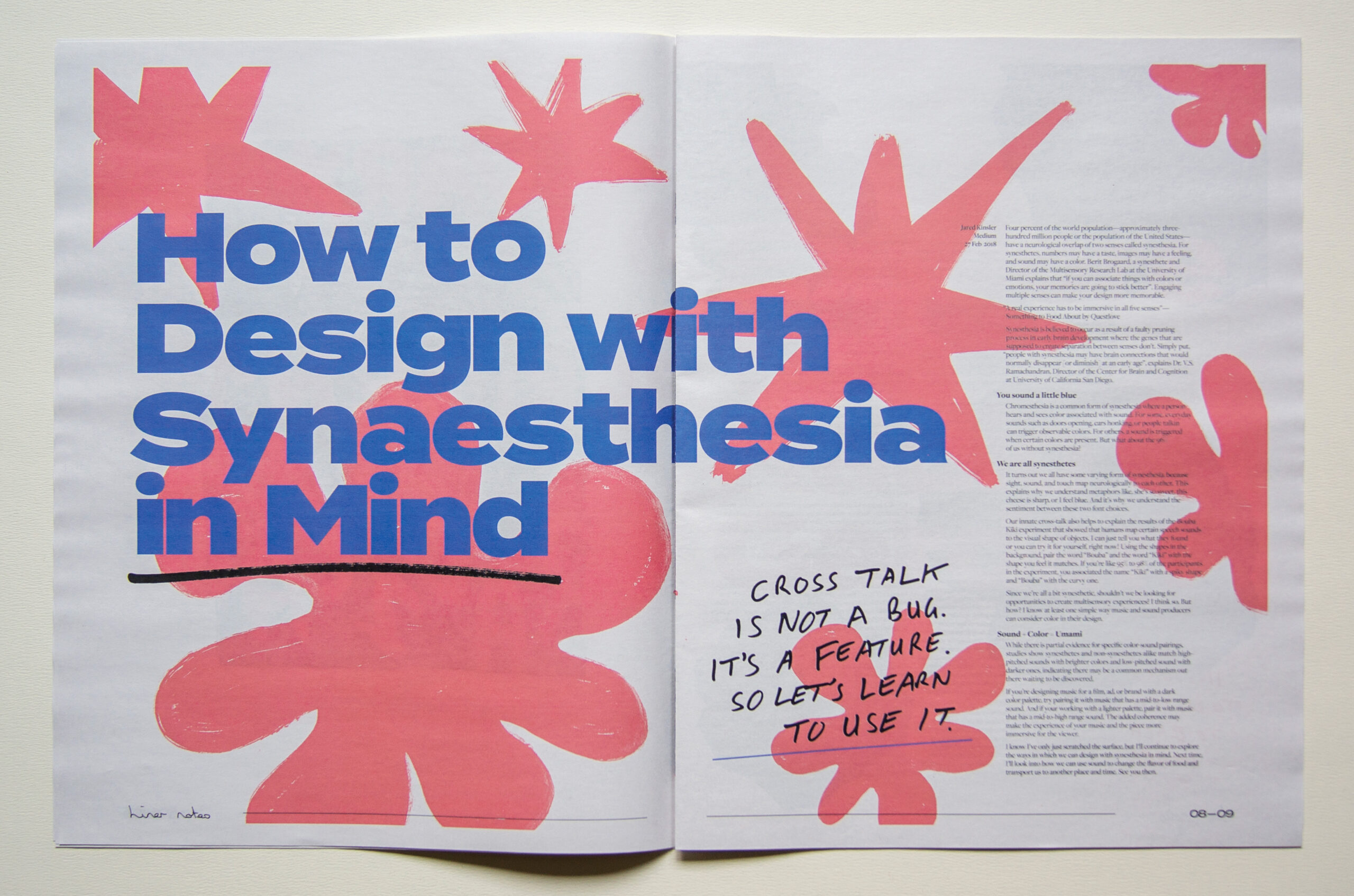
It is heavily inspired by the eclectic and communal effort of music and art, hence the name. I wanted to capture this in an interesting way visually, and I did so by creating a juxtaposition between typical broadsheet sophistication and grungy expressive imagery. Since being aimed at the underground scene and fringe music lovers I feel this works very well. It was also very fun to create and get my family involved in the process.
I enjoyed playing with the illusion of print and post-production, combining hand-written elements from myself and family to add to the aesthetic and play with the readers mind in making them think each piece is unique.
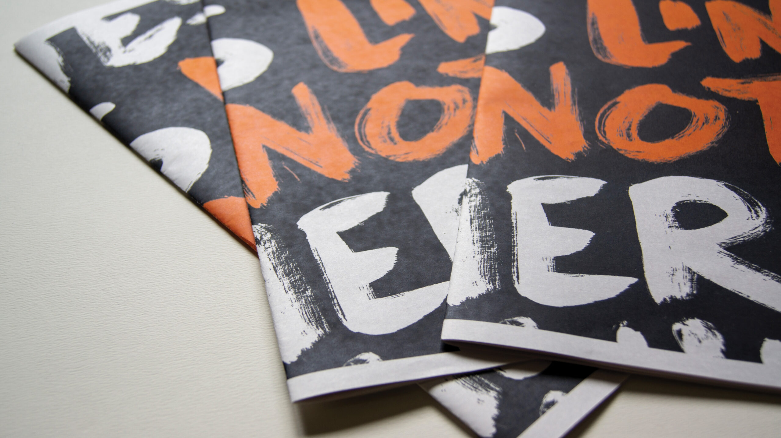
Close-ups of covers that wrap around the spine
Bold and contrasting typefaces
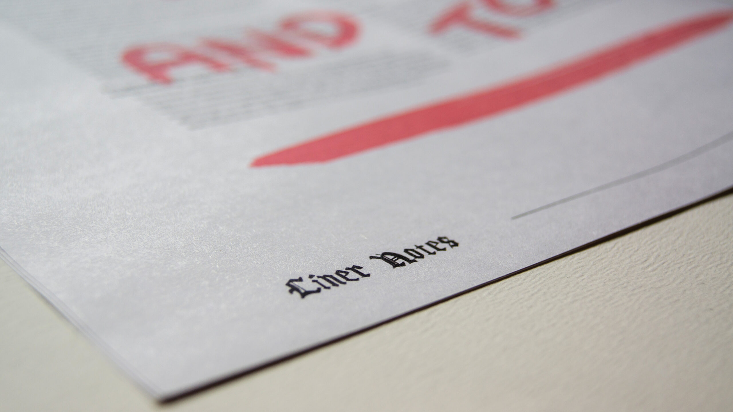
Individual hand-written folios written by myself or family members. Unique to each page
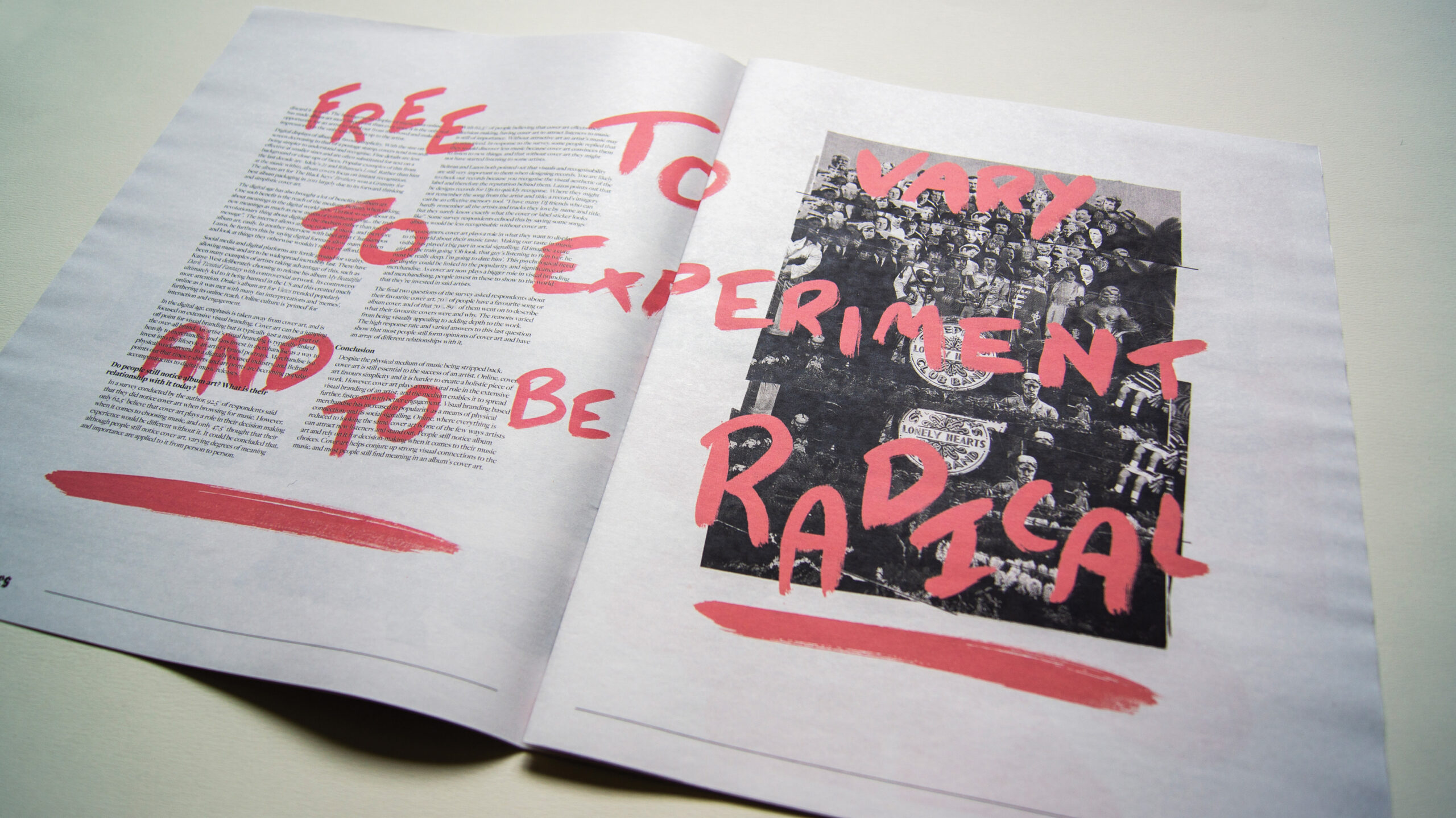
Playing with hand drawn letters and collage grunge styles
Illustrative designs appropriate to content