Glasthrow – Identity & Movement
- Designer Joe Gallagher
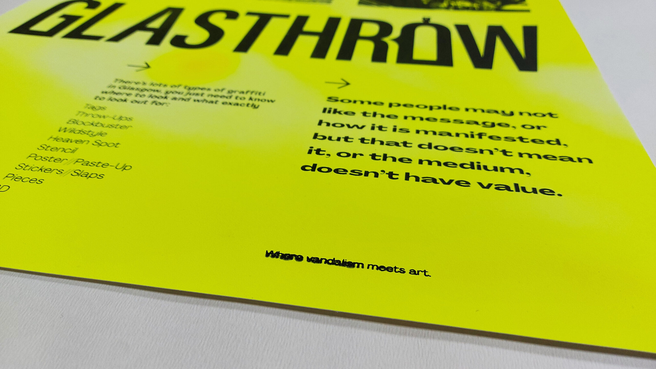
Glasthrow is a self-initiated brief where I chose to answer the question, when does vandalism become art?
I do this by using Glasgow as platform to exemplar what is considered art and vandalism, while creating an identity for the whole movement.
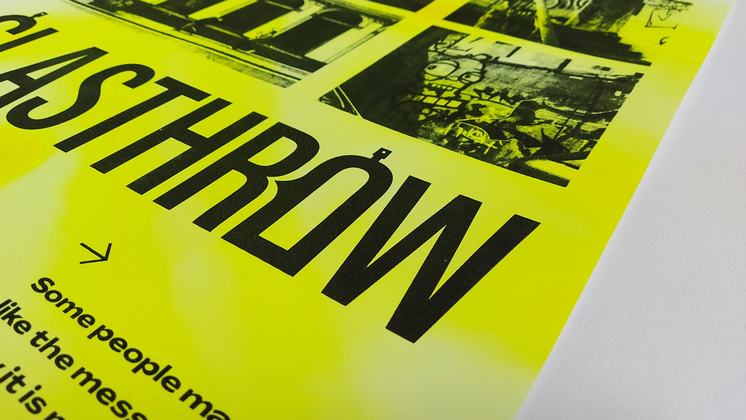
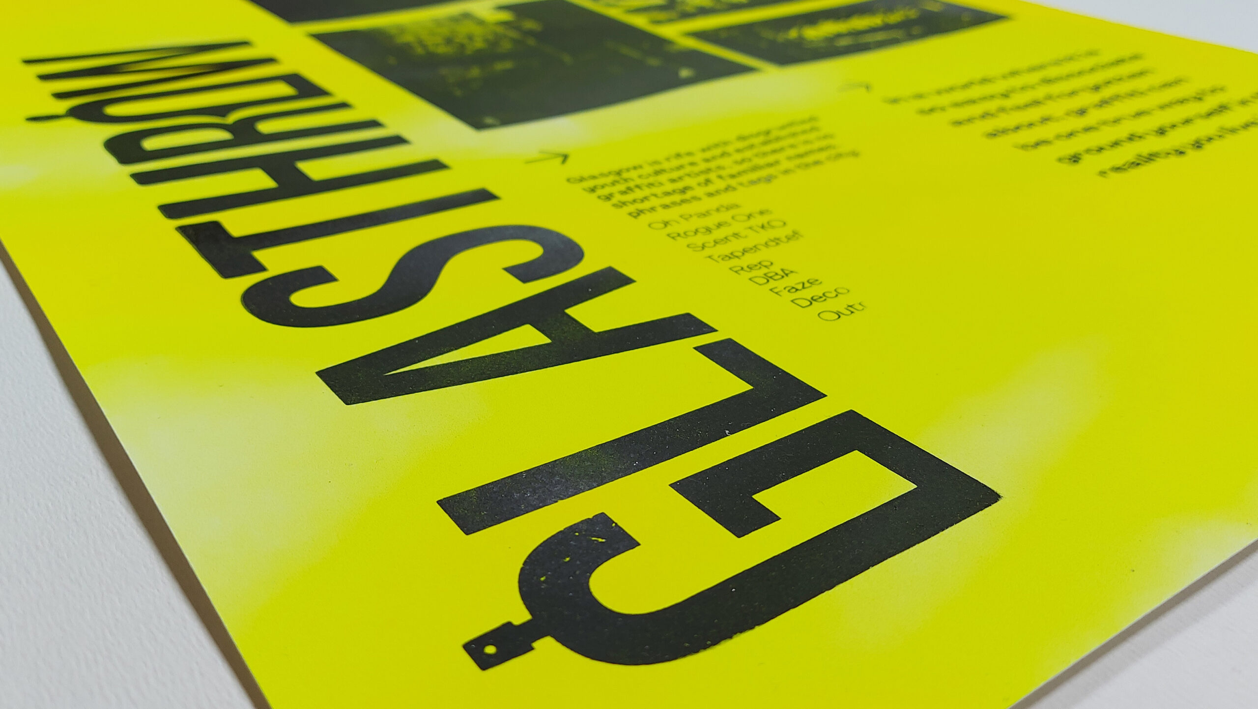
Glasthrow is a portamento of Glasgow and ‘Throw-Up’ (a common style of graffiti). The identity uses a condensed carcass font to appear contemporary and attract the urban target marker, but in there is edited glyphs made to look like a spray can and a speech bubble. What this whole movement is about is starting conversations about graffiti.
A bright green is used as it is taken from the colour palette of a Glaswegian graffiti artist Alko, as well as being an appropriate colour for Glasgow. It is found in its crest and nickname ‘fair green city’.
An identity was needed to base a social media page from – a Glasgow ‘flicks’ page that showcases graffiti from around the city. It is here an animation can be seen of playful paint pen edit of the logotype.
Finally, two commemorative posters were created for the movement. They make use of personally taken photos of Glasgow, screen printed over individually spray-painted pieces of paper, creating unique fine art prints where no two are the same. The posters play on the gritty and grungy texture of screen printing, while also alluding to the layers of graffiti and paint repeated over each other on walls all throughout the city.
The screen print created lot so of textured idiosyncrasies and interesting type
Everything is aligned an modular to keep a rigid look over such an expressive and loud backdrop
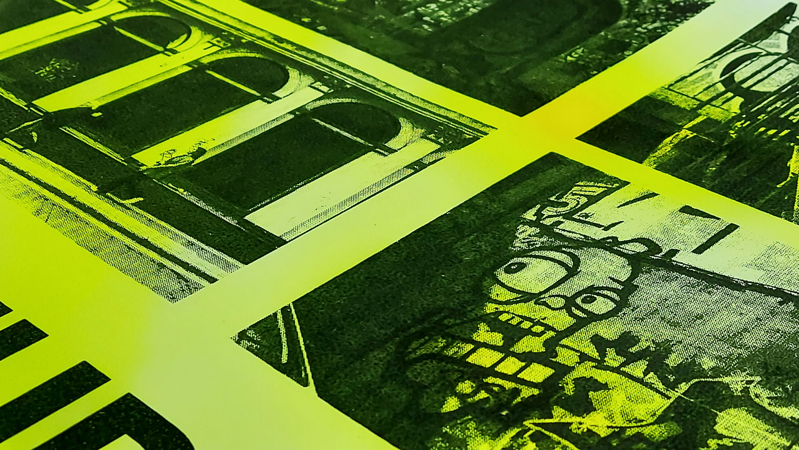
The spray paint under the screen prints creates new versions of the graffiti
Texture and flecks add to the uniqueness of the commemorative print
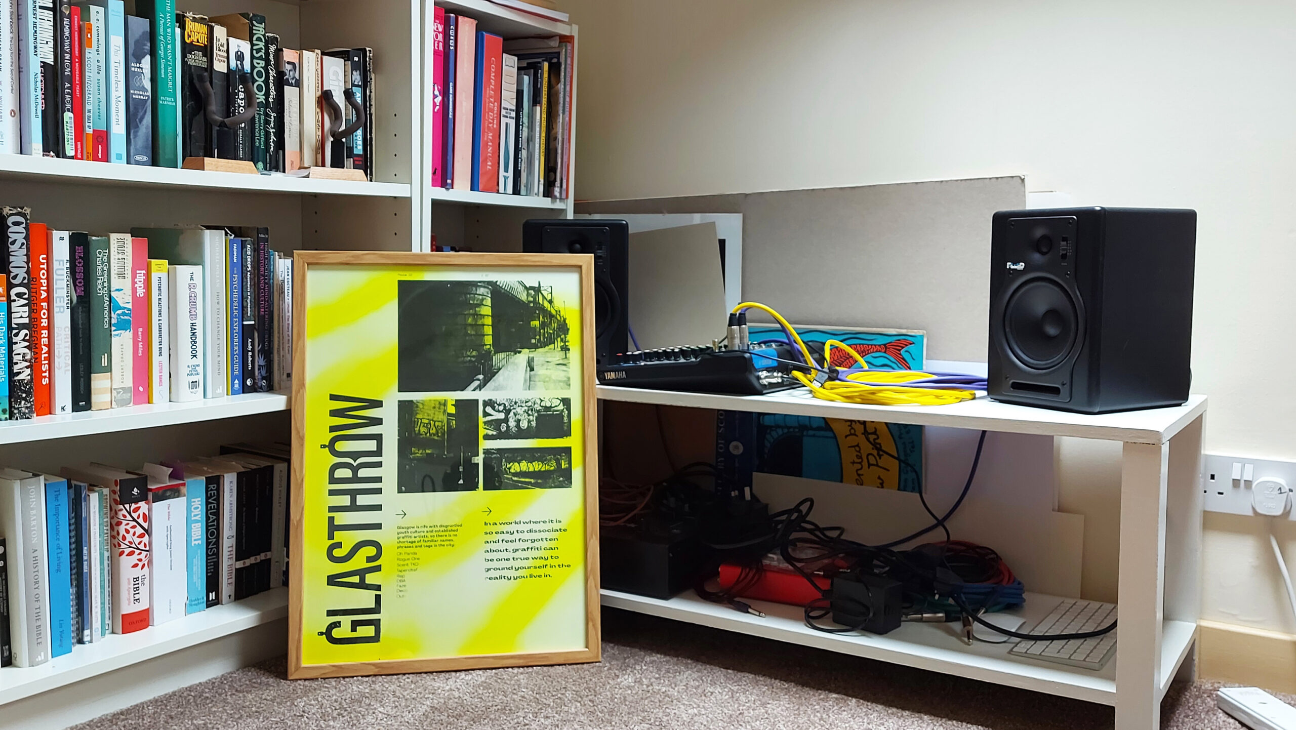
The posters fill a frame nicely and add pops of colour to the room
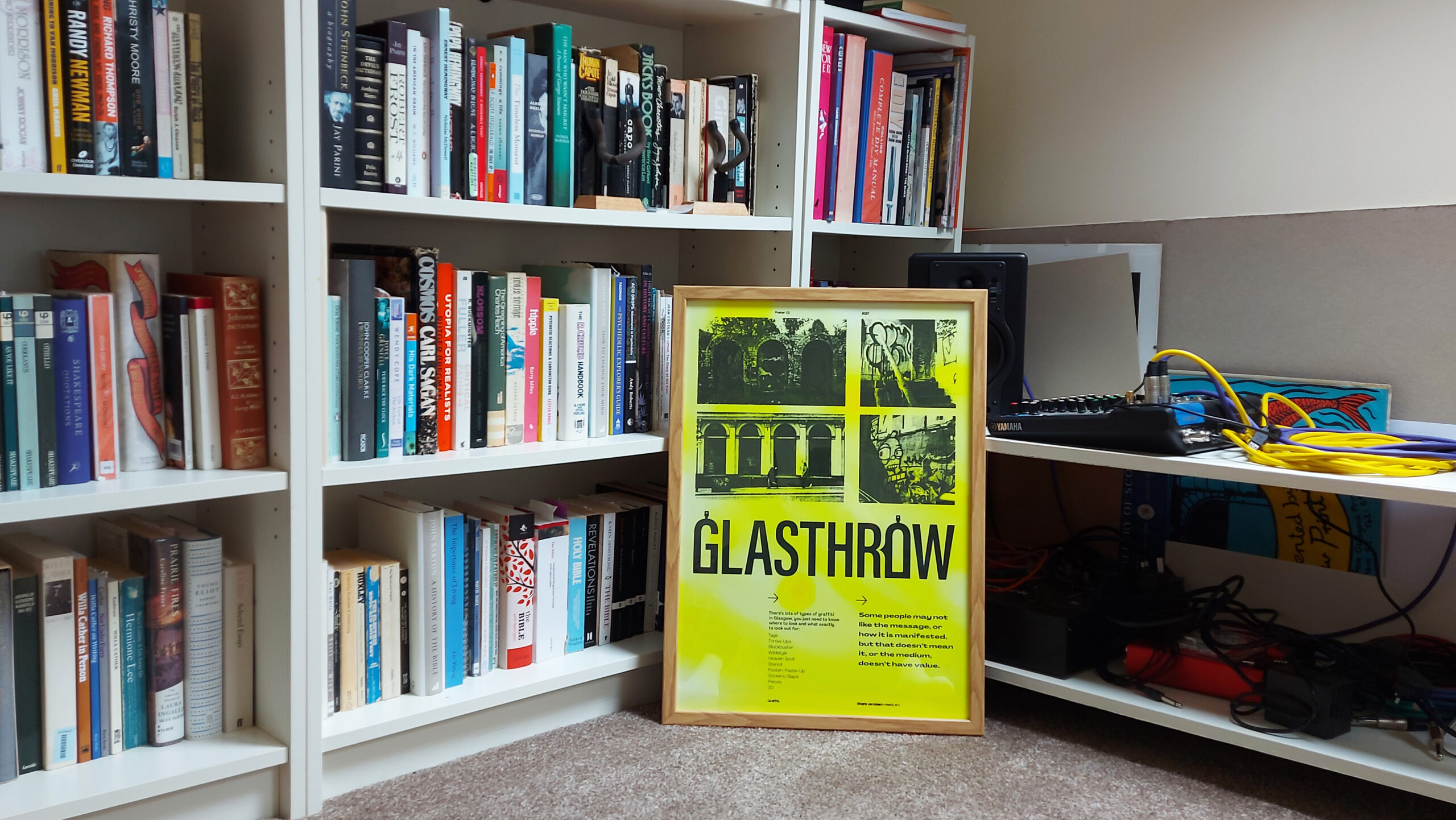
No two posters are the same, making them proud and unique to own