Drinks Packaging
- Designer Jack Adams
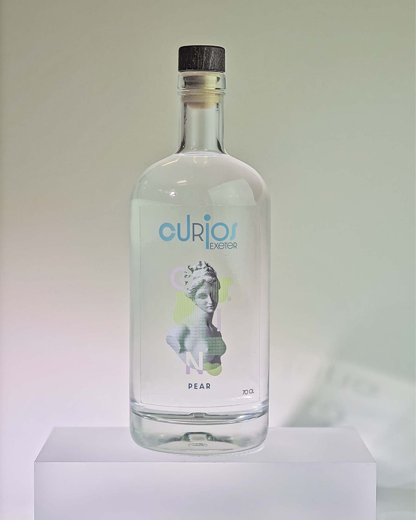
Each student was given a county in England to inspire their design of the bottles with a target market with a slight biast towards female with an age range of 20-30. Three were to be designed and one taken into production, flavours included blackcurrant, juniper and pear.
I received Exeter as the county of interest where I found inspiration from its past roman occupation and history. Creating a collage effect gave a nod to the title of curios, curious to try different flavours. The collage effect was used within the logo itself at different typefaces then on the roman bask itself with mosaic types forming down their body in the colour of the fruit. +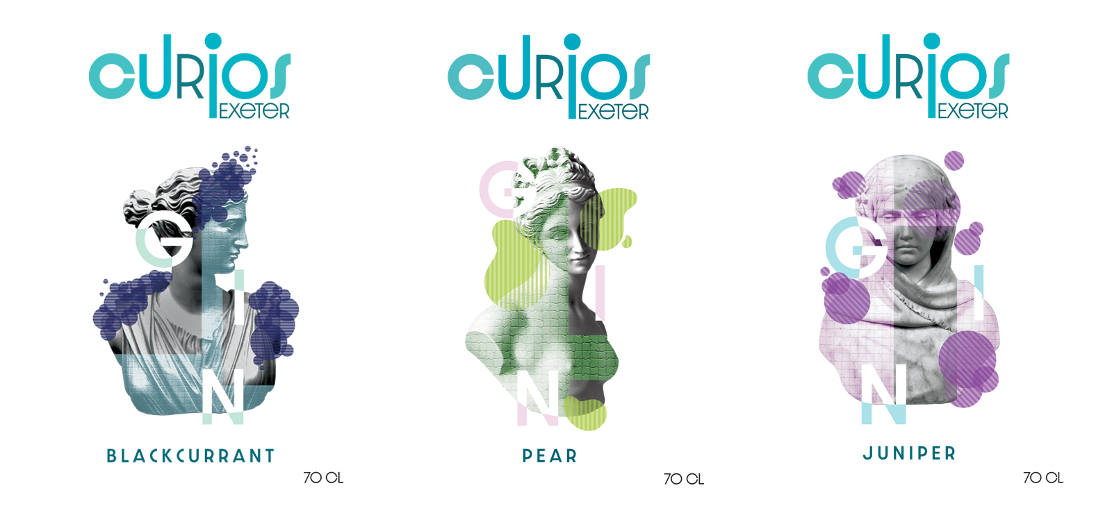
Soft colour was used throughout the imagery and type to create a fresh clean feel, similar to the taste of Gin. The softer approach to colour and a delicateness to the female form would also match perfectly with the target market.
The labels were printed on transparent stickers to let the colour of the gin and light shine through to the colour tiles of the body.