Campaign WWF & Save our Amazon
- Designer Jack Adams
The brief asked for a vivid use of colour mixed with illustration, these two words immediately threw me as this is not in my style at all. At this point in my studies I had generally stuck to muter tones and never touched illustration. However with designing this campaign it introduced me to the idea of using bold tones whilst still keeping an edge to work.
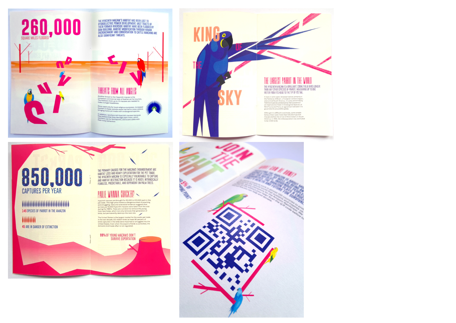
A use of negative space frame the content well without the colour becoming over whelming and taking over the image and creating issues with content. This also answered the briefs use of vivid colour while still keeping a sophistication and keeping away from appearing child like. Vector illustrations of bird appeared around the illustrations with a noticeable absence or replaced with falling feathers when the content explains data of their vulnerability or extinction.