By Galla – Branding & Stationery
- Designer Joe Gallagher
One of the hardest things designers ever must do is design for themselves, but that is exactly the challenge I set out for myself here.
Approaching the end of my design course it was due time to create my own branding, stationery, and promotion to help my adjustment into the industry.
The indent is inspired by the short form of my last name Gallagher, and the designer Parra in France. He is of great influence on me and has a shop called ‘By Parra’. It felt right for my brand as I wanted to steer away from the monogram stereotype you see a lot of designers use. Galla has a sense of ambivalence and intrigue which I love. The word ‘by’ implies it is something I’m creating too.
To add flair to the identity and showcase my graphical and typographic talent, I adapted a typeface to have unique and playful ligatures.
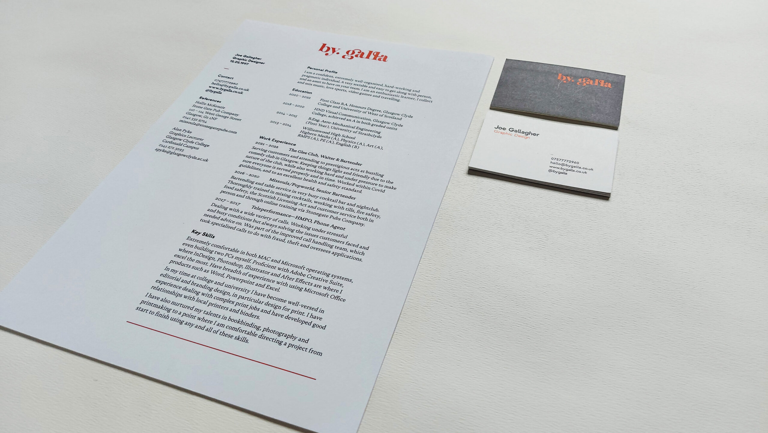
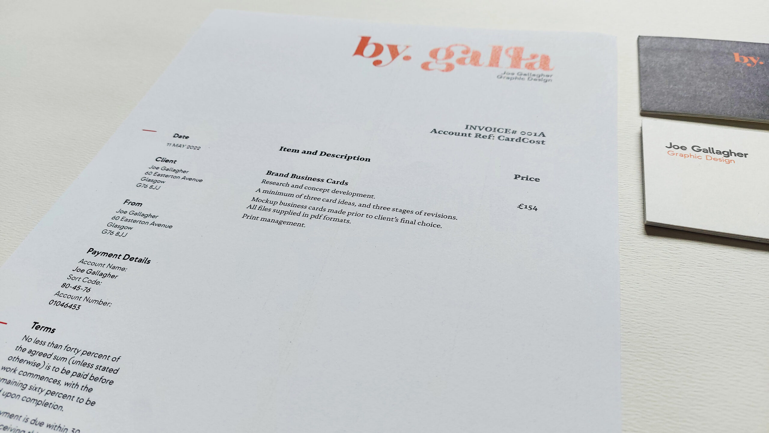
In my stationery I know it is of great importance to keep things consistent and familiar. All my prints follow the same grid and layout, which looks clean, smart, and sophisticated – ideal for how I want to come across to clients.
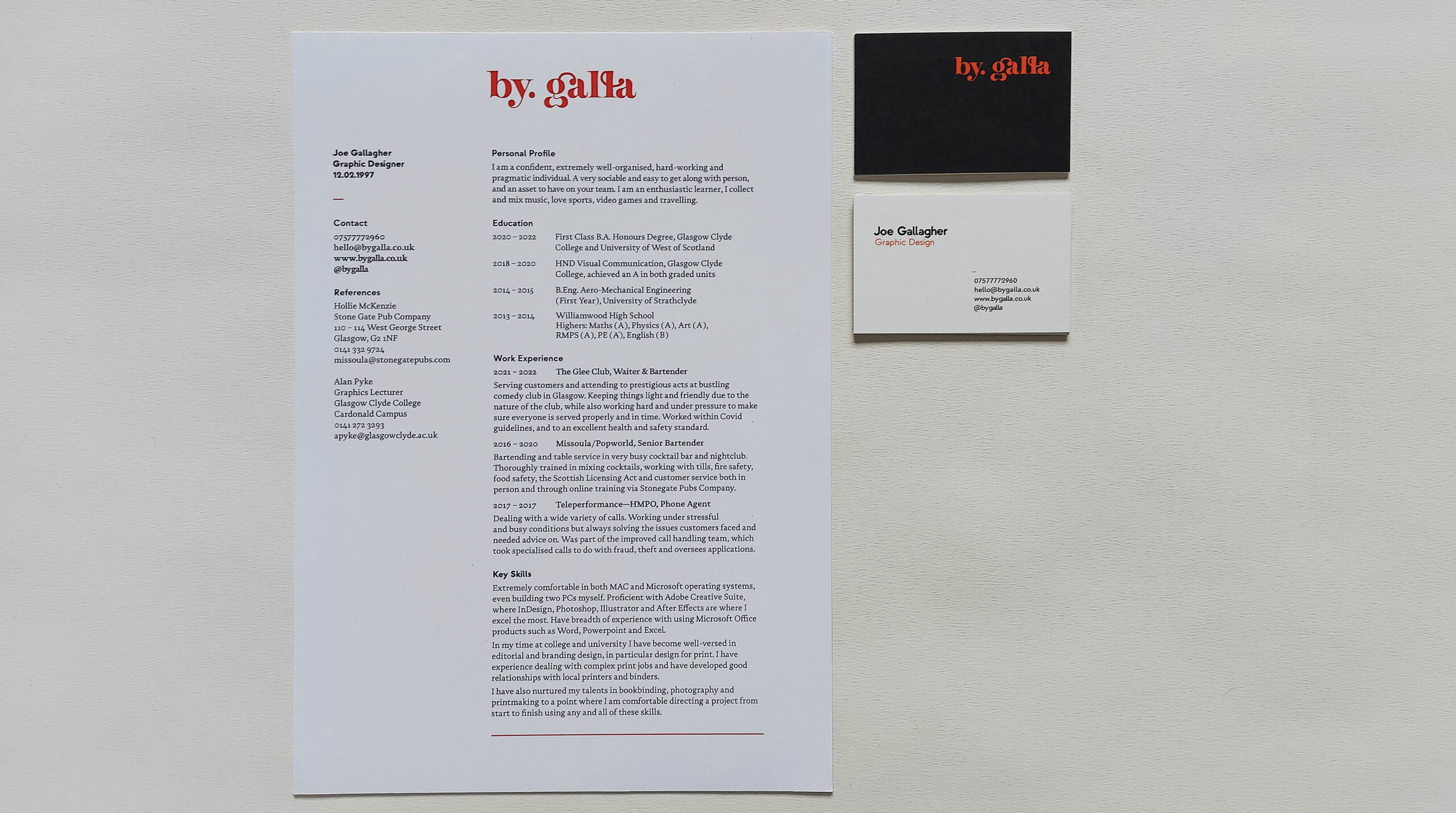
CV and business cards together showing harmony and consistency
Depth of typography and sophisticated type across materials
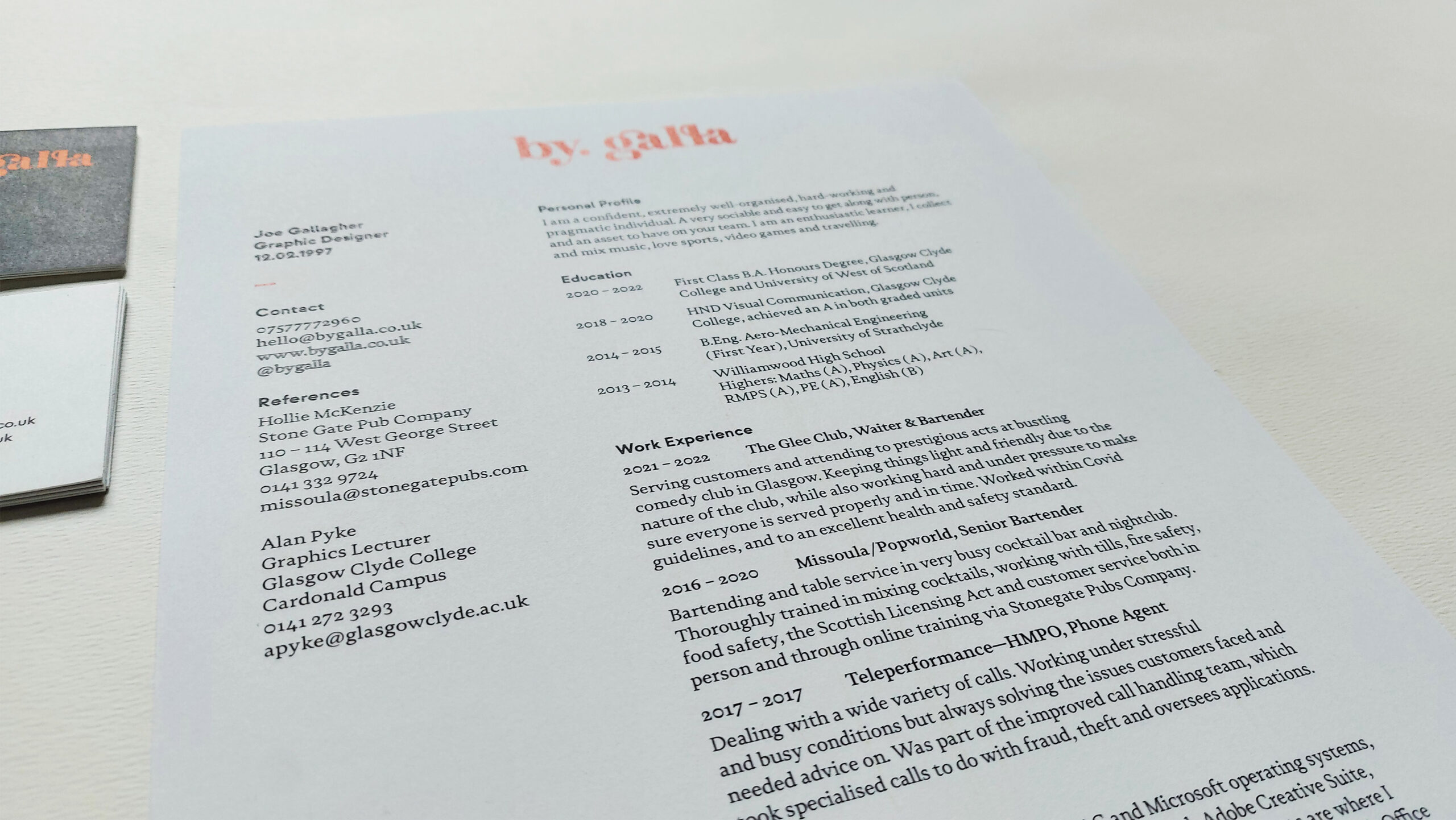
Clever use of hierarchy and tabbing guides the reader through the content
Repetition of style reaches all brand materials
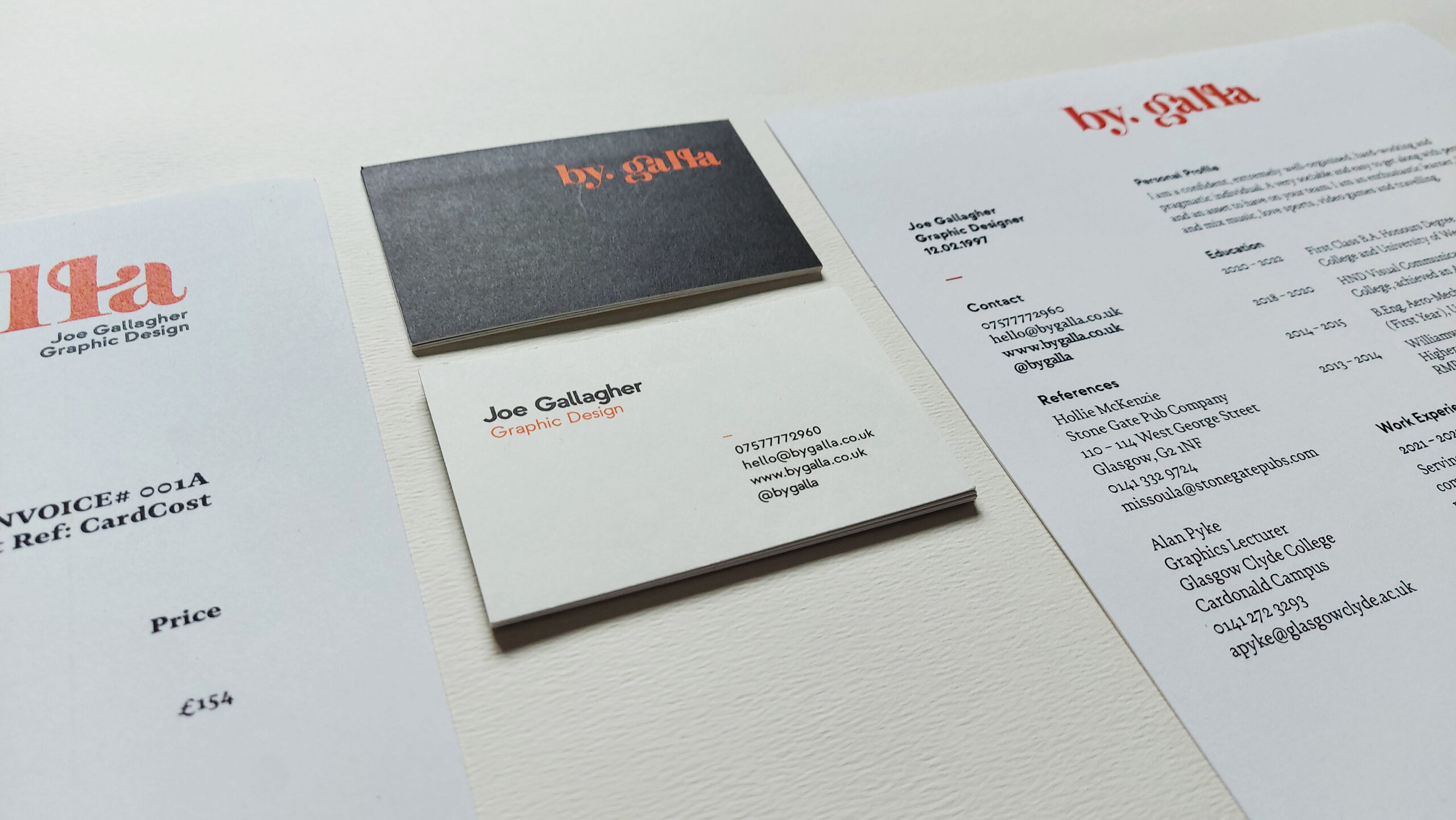
Type pairings used throughout and on business card